

Ads: the paid media desk
Thirteen analysts, the openings engine, what it can change itself versus what it hands you, and why targeting writes are refused in code.
Setting it up
Three steps, and only the first needs anything from you.
Connect the ad account
On Connections, under advertising. You are authorising the ad account itself, so do it from an account with permission on it. If you manage several ad accounts, connect the one you want read: this is per account, not per business manager.
Wait for the first deep read
It pulls the last 30 days across three grains: campaign, ad set and ad, plus the placement, age and country breakdowns. On a busy account the first pass takes a few minutes. You do not have to watch it.
Open Ads in the sidebar
The item appears once the account is connected. If it is not there, the connection did not complete.
After the first read it keeps itself current on its own: a light refresh every five minutes for today's numbers, and the full analyst pass every three hours. You never press refresh.
Tell it what each campaign is for
This is the step that decides whether the whole desk is useful, and it is the one people skip.
Your operator derives initiatives from your campaigns, and each one carries a goal. A campaign built for leads and a campaign built for awareness are judged completely differently, and if the goal is wrong every number downstream is measured against the wrong thing.
If a campaign is set to the wrong goal, the desk will confidently tell you an awareness campaign has a terrible cost per lead. That is not the desk being stupid; it is measuring exactly what it was told to measure. Check the goals once, at the start, and the rest of the product works.
What it does and does not need
| Needs | Does not need |
|---|---|
| Read access to the ad account | Access to your business manager |
| Campaigns that have actually spent | A minimum budget |
| A goal set per initiative | Any change to how you build campaigns |
| Your own model connection, for custom reports | Anything installed on your website |
How to read what you are looking at
The desk reports in a deliberately narrow set of quantities. Learning these five takes two minutes and makes every screen readable.
| What you see | What it actually means | The trap |
|---|---|---|
| Cost per result | Spend divided by the results for that initiative's own goal. For a lead campaign that is cost per lead. | Comparing it across initiatives with different goals. A cost per lead and a cost per view are not the same unit. |
| Results | Counted from the goal event the campaign was set up for. | If the goal is wrong, this counts the wrong thing and everything derived from it is wrong too. |
| Share | How much of the spend or the results one slice accounts for. | A big share of spend is not automatically bad. Read it against the share of results. |
| Confidence | How sure the test is, given how much data there is. | Low confidence is shown rather than hidden. It means keep watching, not ignore. |
| Up to N leads | The ceiling an opportunity supports. | It is not a forecast. Treating a ceiling as a projection is the fastest way to be disappointed by a real finding. |
Why nearly everything is per dollar
The tests use dollars as the denominator rather than impressions. That sounds like an implementation detail and is not: it means the thing being measured is leads per dollar, whose inverse is cost per lead, which is the number you actually make decisions on.
A slice can look wonderful per impression and be terrible per dollar, because it is expensive to reach. Measuring per impression would recommend it anyway.
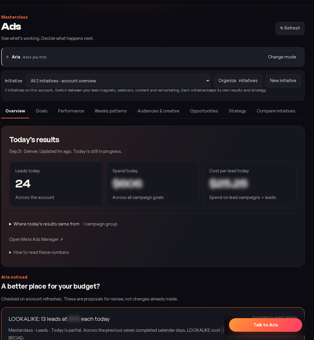
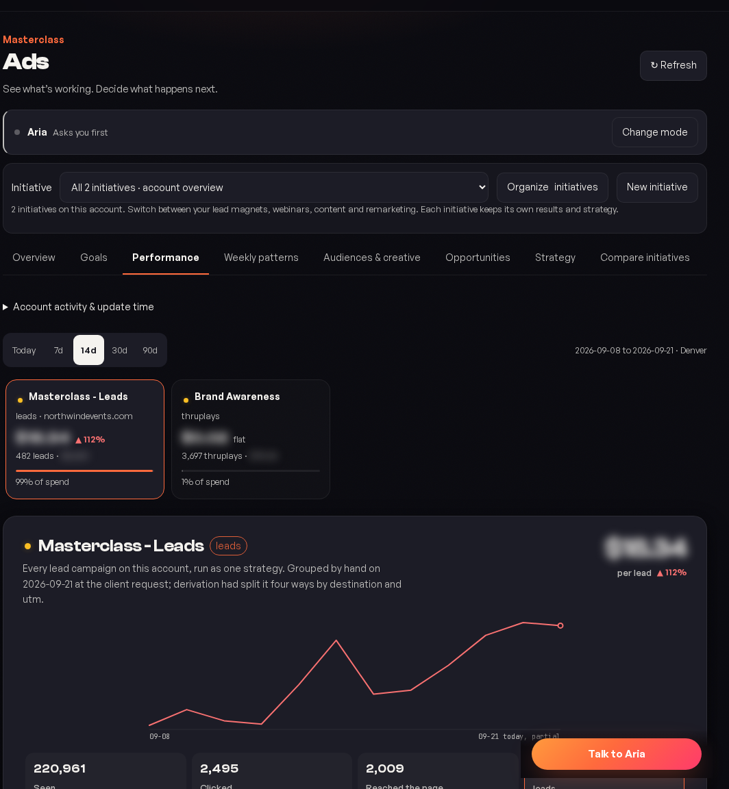
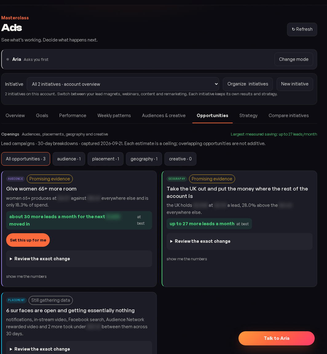
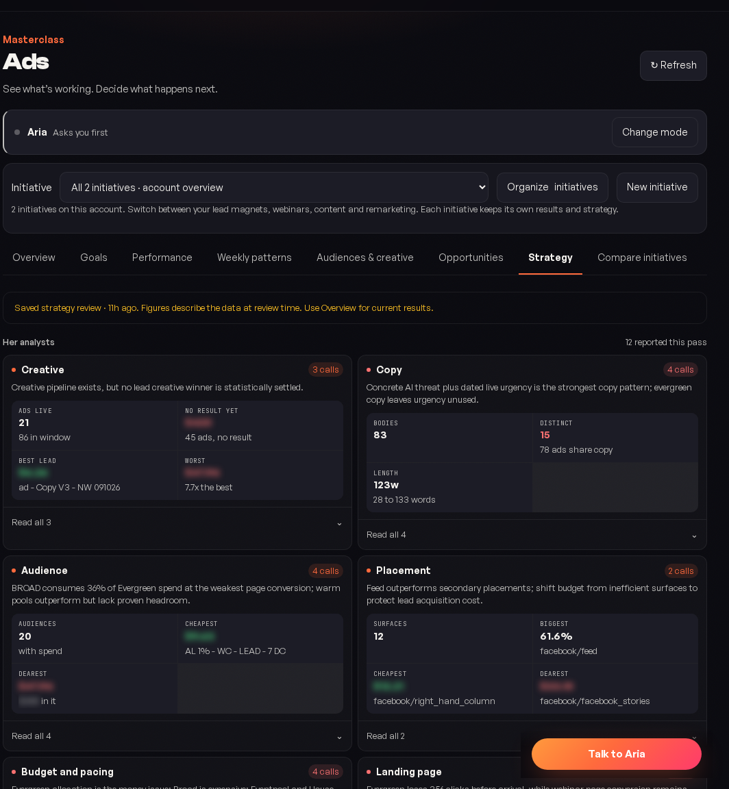
The screenshots on this page come from a real account that is actually running, so that what you see here is what the desk really produces rather than a mock-up. One rule has been applied to all of them: every identifying detail is substituted and every currency amount is blurred. The business, the operator's name, the destination domain, the campaign and audience names, the city and the ad account id are all invented. Volumes, percentages, dates and every word of the operator's own reasoning are untouched, because those are the part worth reading.
Reading the Overview
Start with what changed
Not with the totals. Totals move slowly and tell you little day to day; the change list is where the information is.
Then the ranked plan
Ordered by expected impact, not by recency. The top item is the one worth your next hour.
Then anything flagged low confidence
These are worth knowing about and not worth acting on yet. Watching one for a week is often the right response.
Reading Performance
One row per initiative, judged against its own goal. Three patterns are worth recognising on sight:
| Pattern | Usually means |
|---|---|
| Cost per result climbing while results hold | You are paying more for the same. Often creative fatigue. |
| Results falling while cost per result holds | Delivery is shrinking rather than getting less efficient. Usually budget or audience size. |
| Both good, on a small spend | The candidate for scaling, and the place to check the openings first. |
Reading Opportunities
Every opening names a slice, a detector and a size. Read them in that order, and read the size last, because the size is the part most likely to be misread.
| Detector | Plain English | Typical action |
|---|---|---|
| Drain | This slice is taking real money and giving little back. | Exclude it, or cut its share. |
| Underfed | This slice is doing well on very little. | Give it more, carefully. |
| Untried | Nobody has spent anything here, so we do not know. | A small test, sized by the ceiling shown. |
| Format gap | You are not running a placement or format at all. | Worth one test before concluding it does not suit you. |
An untried opening is not a prediction that the slice is good. It is a statement that its performance is unknown, which is a different and more useful thing: it tells you where a cheap test would buy you information rather than where to move budget today.
Reading History
Every change, who made it, and what happened either side. This is the screen to open when someone asks why a number moved, and it is the reason the desk can answer that question at all.
If you run paid media and connect the ad account, your operator gets a dedicated desk: a team of analysts that reads the account every few hours, one lane each, and a chief that arbitrates where they disagree into a single ranked plan.
The Ads item only appears in your sidebar once an ad account is actually connected. A nav item that always leads to an empty state teaches people to stop clicking the nav.
The nine views
The desk opens on Overview. The other eight are tabs across the top, in this order, and they are ordered deliberately: the first four tell you what is happening, the middle three tell you what to do about it, and the last two are how you check the answer.
| View | What it answers |
|---|---|
| Overview | What is happening in the account right now, what changed since last time, and what is worth your next hour. |
| Goals | What each initiative is actually for, the deadline, and the limits your operator has to respect. This is the screen that makes every other number mean something. |
| Performance | How each initiative is doing, judged against the goal it was set up for, never against a house average. |
| Weekly patterns | Sundays compared with Sundays. Which days and which hours actually convert, with volume, spend and efficiency side by side so a cheap day is not mistaken for a good one. |
| Audiences & creative | Which audiences and which pieces of creative are carrying the account, plus targeting that exists and you are not using, and a builder for lookalikes. |
| Opportunities | Where money is going that should not, and which slices nobody has bought at all. |
| Strategy | What each of the thirteen analysts found, in its own lane, and how the chief arbitrated where they disagreed. Open Read the working on any finding to see the evidence under it. |
| Compare initiatives | The same question asked across several campaigns at once: how they work together, where two of them are buying the same person, and which shared destinations are worth investigating. |
| History | Every change, who made it, and what happened to the numbers either side. |
A view appears whether or not it has anything to say. When there is not enough data for one, it tells you that in plain words rather than showing you an empty chart, because an empty chart reads as a zero and a zero is a claim.
The council of thirteen
Rather than one model looking at everything, thirteen analysts each read the same fact pack through one lane: creative, copy, audience, placement, landing page, attribution, policy and the rest. They disagree, often, and the disagreement is the point.
A chief synthesises them into one ranked plan. Where two analysts reach opposite conclusions from the same numbers, that tension is shown rather than averaged away, because an averaged recommendation is usually the one nobody would defend.
The desk runs every three hours. You do not need to open it on a schedule: anything worth acting on is in the plan the next time you look, and the ranking is by expected impact rather than by recency.
The openings engine
The part clients notice first. It reads the placement, age and country breakdowns that most accounts ingest for months and never look at, and it answers a question the Meta interface does not put in front of you: which slices are cheap and starved?
| Detector | What it finds |
|---|---|
| Drain | A slice taking real money and returning little. |
| Underfed | A slice performing well on a small budget that nobody has scaled. |
| Untried | A slice with no meaningful spend at all, so its performance is unknown rather than bad. |
| Format gap | A placement or format the account is simply not running. |
How an opening is sized, and why the number is a ceiling
Every opening is sized in leads, or it is not reported. The test is a statistical comparison with dollars as the denominator, so what is being measured is leads per dollar, whose inverse is cost per lead, which is the number you actually care about.
The size is always stated as a ceiling, never as a forecast. An opening that says up to 40 leads means the evidence supports at most that, not that you will get it. Treating a ceiling as a projection is the fastest way to be disappointed by a real finding.
Four male age bands all showing the same thing are rolled up into one insight rather than reported as four, because four restatements of one fact read as four times the evidence.
What it can change, and what it hands you instead
This is the most important section on the page, and the honesty in it is deliberate.
| Your operator can do this itself | It hands you the edit for this |
|---|---|
| Pause and resume a campaign, ad set or ad | Anything that touches targeting |
| Set an ad set budget | Adding or removing an audience |
| Move budget between ad sets, lowering first and rolling back if the second half fails | Anything with no safe API route |
| Rotate creative |
Targeting writes are refused in code, not discouraged in a prompt. Sending targeting through the provider's ad update is a full replace that cannot express custom audiences: it echoes the fields back, reports success, sends nothing, and silently deletes every custom audience and exclusion on the ad set. That loss is not recoverable, so a before and after check would only ever detect damage it had already done. The only safe answer was to make it impossible.
When there is no safe lever, your operator does not go quiet. It gives you the exact edit, a deep link straight to the right screen, and then confirms from the delivery data afterwards that the change actually happened. A handover is a job it finishes, not a job it drops.
How it knows whether its own changes worked
Every change it makes is measured over equal windows either side, excluding the day of the change itself.
Equal windows
Seven days before against seven days after. Comparing a fortnight to a weekend produces a number that means nothing.
The change day is excluded
A day that is half old settings and half new belongs to neither side.
It can reverse its own change
Within your permissions, and it will say that it did.
It reports what was observed
Not what it hoped. A change that made no difference is reported as having made no difference.
Goals and limits
You can set cost, scaling and delivery targets, review the strategy it proposes, and permit specific actions within explicit limits. The limits are real: a spend ceiling is a ceiling it cannot raise, and autonomy here follows the same ladder as everywhere else.
Start with the desk in read only and act on the plan yourself for a fortnight. You will learn quickly whether its ranking matches your judgement, and that is a much better basis for granting autonomy than a feature list.
Custom reports
Ask for a metric or a report that does not exist and it will build it, calculated and saved on your own server using your own model connection. Where it genuinely cannot do something, the request becomes a review item rather than a silent failure.
Meta today. If you need another, ask on Requests and we will scope it.
Only if you have moved it up the ladder and set a ceiling, and never above that ceiling. Budget moves are two sided: it lowers one side first and rolls back if the other half fails.
Reading is safe and useful. Writing is a full replace that destroys custom audiences irrecoverably. Both facts are true at once, which is why the read is available and the write is refused.
Read the evidence and the falsifier attached to the finding. Each one states what would have to be true for it to be wrong, which is a faster way to settle it than arguing with a conclusion.
The detectors need enough spend to say anything with confidence. On a small account you will see fewer findings rather than weaker ones, which is the correct behaviour.
Reading a finding
Every finding comes with three things attached, and the third is the one worth learning to use.
| Part | What it is for |
|---|---|
| Evidence | The numbers it is drawn from, so you can check the arithmetic. |
| Confidence | How sure it is. Low confidence findings are still shown, labelled, rather than hidden. |
| Falsifier | What would have to be true for this finding to be wrong. |
When you disagree with a finding, go straight to the falsifier. It is a much faster way to settle an argument than debating the conclusion, because it tells you exactly which number to go and look at.
Common questions about the numbers
Because the underlying data supports a range. Collapsing it to a single figure would look more decisive and be less true.
Usually because more data arrived and the gap closed, which is the system working. History keeps the record of what it said and when.
Check which goal the initiative is set up for. An ad set that looks excellent on clicks can be a drain on leads, and the desk measures against the goal the campaign was actually built for rather than the metric that flatters it.
Not enough spend for the test to say anything. You will see fewer findings on a young campaign rather than weaker ones, which is the correct behaviour.
Was this page helpful?